PYDERIN is a name that contains the initials of Purity, Derm (skin science), Regeneration, and Neo (new generation).
This symbolizes PYDERIN's philosophy of evolving beyond simply inheriting existing PDRN to next-generation skin regeneration science (Next-Generation Regeneration).
PYDERIN is a Neo-Regeneration brand that refines nature's life energy through science and breathes new life into the skin.
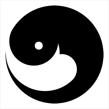
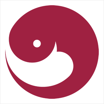
PYDERIN's symbol was inspired by the form of salmon, which symbolizes nature's cycle and life regeneration.
The red curve represents the flow of life energy and continuous recovery (rejuvenation),
while the soft white curve at the bottom contains the image of a warm gesture symbolizing 'stability' and the moment of skin stability and regeneration.
This form is not just a simple logo, but visually expresses the philosophy of a brand that studies the science of skin regeneration: circulation, recovery, and trust.
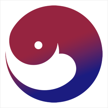
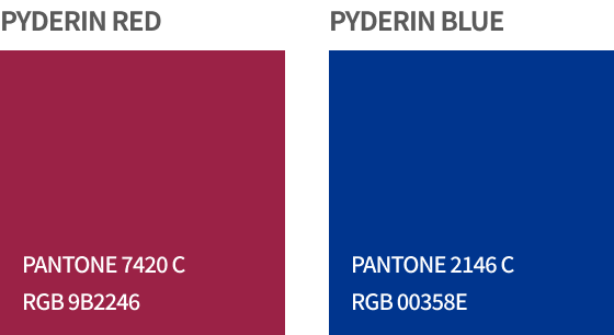
PYDERIN's main colors are divided into PYDERIN RED and PYDERIN BLUE.
PYDERIN RED symbolizes the skin's regenerative power and warm life energy, expressing the vitality of PDRN, the brand's core material.
PYDERIN BLUE symbolizes trust, stability, and the professionalism of medical technology, representing the brand's scientific foundation.
Together, the two colors visually complete PYDERIN's philosophy of 'harmony of scientific beauty'.